Fundamentals of Color Theory
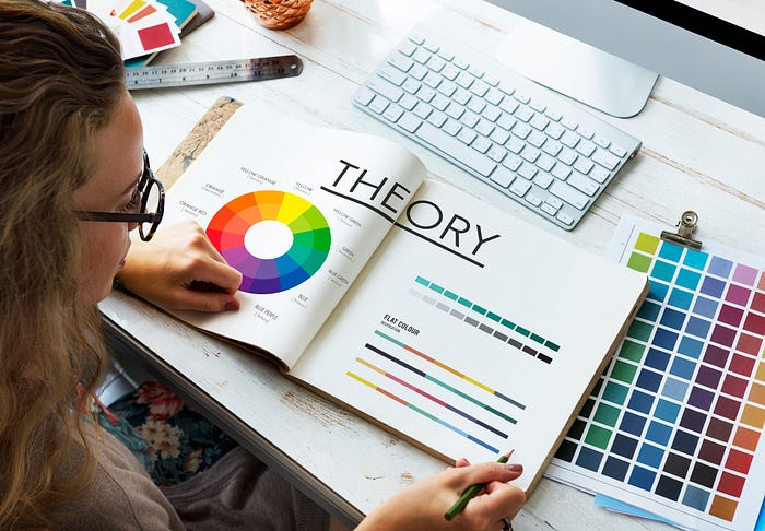
The fundamentals of color theory are the foundational concepts and principles that help explain how color works and how it can be used in various applications, such as art, design, and visual communication. These concepts include:
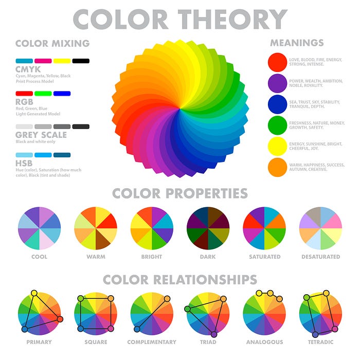
Color wheel: A color wheel is a tool that displays the relationships between primary, secondary, and tertiary colors.
Hue: Hue is a pure color without any tint, shade, or tone.
Saturation: Saturation is the intensity or purity of a color.
Value: Value refers to the lightness or darkness of a color.
Color temperature: Color temperature refers to the warmth or coolness of a color.
Color harmony: Color harmony refers to the use of color combinations that are pleasing to the eye and create balance.
Color psychology: Color psychology studies how colors can affect emotions, behaviors, and perceptions.
Color temperature contrast: Color temperature contrast refers to the contrast between warm and cool colors. Warm colors include red, orange, and yellow, while cool colors include blue, green, and purple. Using warm and cool colors together can create a sense of depth and dimension in a composition.
Color context: Color context refers to the way that colors can appear differently depending on the colors around them. For example, a color may appear brighter or darker depending on the colors that surround it.
Color symbolism: Different colors can have different cultural or symbolic meanings. For example, red can be associated with love, anger, or danger depending on the context.
Color palettes: A color palette is a collection of colors that are used together in a design. Choosing the right color palette can be crucial for creating a successful and effective composition.
Color balance: Color balance refers to the distribution of colors in a composition. A well-balanced composition will have an even distribution of colors that creates a sense of visual harmony
Color depth: Color depth refers to the use of light and dark colors to create a sense of depth and dimension in a composition.
Color Wheel
The color wheel is a visual representation of the relationships between primary, secondary, and tertiary colors. It’s a fundamental tool used in color theory, art, design, and other fields that use color.
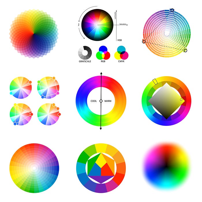
The traditional color wheel is made up of 12 colors, arranged in a circular pattern. At the center of the wheel are the primary colors: red, blue, and yellow. These colors cannot be created by mixing other colors.
The secondary colors are created by mixing two primary colors together.
colors are green (yellow + blue), orange (red + yellow),and purple (blue +red).
They are located between the primary colors on the wheel
Tertiary colors are created by mixing a primary color with a secondary color.
These colors include yellow-green, blue-green, blue-purple, red-purple, red-orange, and yellow-orange.
They are located between the primary and secondary colors on the wheel.
A color wheel is a useful tool for understanding color relationships and creating color schemes.
For example, complementary colors are located opposite each other on the wheel and can create a striking and visually appealing contrast when used together. Analogous colors are located next to each other on the wheel and can create a harmonious and soothing effect when used together. Triadic colors are located at equally spaced points on the wheel and can create a balanced and dynamic color scheme.
Hue
Hue is a term used in color theory to describe the purest form of a color, without any variation in brightness or saturation.
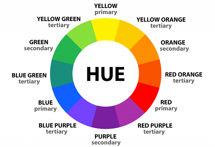
It is the specific wavelength of light that is reflected by a surface and perceived by the human eye as a certain color. Hues are often described using the color wheel, which arranges colors in a circular format based on their relationship to each other.
Hues can also be described using their position on the color wheel,
such as warm hues (red, orange, and yellow) or cool hues (blue, green, and purple).
The brightness or darkness of a hue is referred to as its value,
while the intensity or purity of a hue is referred to as its saturation.
Hue is an important concept in color theory because it allows us to create effective color combinations and schemes.
By understanding how different hues interact with each other, we can create compositions that convey different emotions, meanings, and moods.
Saturation
Saturation, in color theory, refers to the intensity or purity of a color. It describes how vivid or bright a color is, and is often described as the strength or weakness of a color.
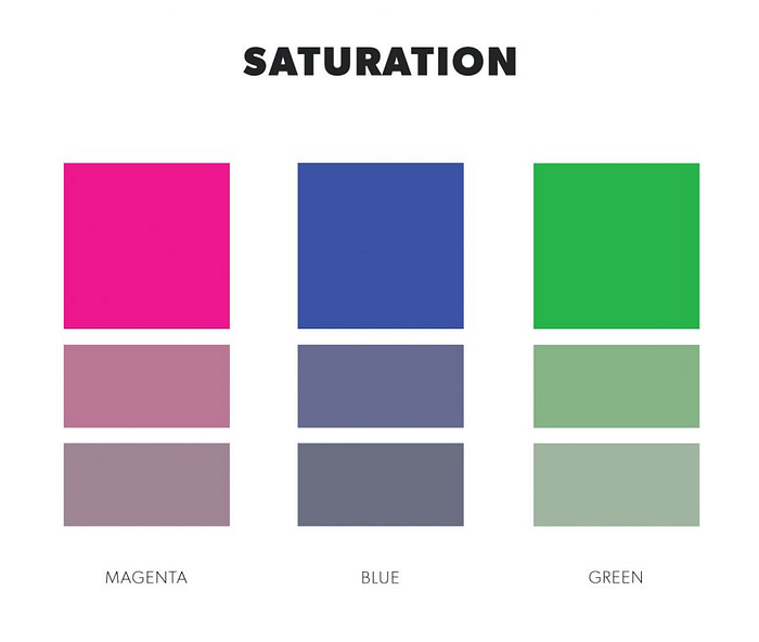
A fully saturated color is the purest form of the color, while a desaturated color has had some of its intensity removed.
Saturation can be adjusted by adding white or black to a hue, which creates a tint or shade respectively. Adding white to a hue increases its saturation, while adding black decreases it.Another way to adjust saturation is by mixing a hue with its complementary color, which creates a desaturated or muted color.
Saturation is an important concept in color theory because it can significantly impact the mood and visual impact of a composition.
High saturation colors are often associated with energy, excitement, and intensity, while low saturation colors are often associated with calmness, subtlety, and sophistication.
By adjusting the saturation of colors in a composition, designers, and artists can create a range of visual effects and emotions
Color Value
Color value refers to the lightness or darkness of a color, also known as its brightness.

It is an important aspect of color theory because it can greatly affect the mood, tone, and visual impact of a composition
In terms of color value, a color can be described as a tint, shade, or tone.A tint is created by adding white to a color,which makes it lighter in value.A shade is created by adding black to a color, which makes it darker in value.A tone is created by adding gray to a color,which desaturates it and reduces its brightness.
When creating a composition, designers, and artists often consider the balance and contrast of color values to create a visually appealing and effective design.
By adjusting the value of colors, they can create a range of visual effects and emotions, such as highlighting certain elements, creating depth and dimension, and evoking different moods and tones.
Color Temperature
color temperature refers to the perceived warmth or coolness of a color.
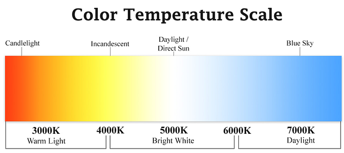
It is based on the color’s position on the color spectrum, ranging from warm hues such as red, orange, and yellow to cool hues such as blue, green, and purple.
The color temperature scale is often described in terms of the Kelvin (K) scale,which is a measure of the color temperature of a light source.Warm colors are associated with lower Kelvin temperatures the warm glow of candlelight (around 1,000K) or the orange glow of a sunrise (around 2,000K). Cool colors are associated with higher Kelvin temperatures, such as the blue light of a cloudy sky (around 7,000K) orthe bright white light of midday sun (around 5,500K).
Color temperature can greatly affect the mood and atmosphere of a composition
Color Harmony
Color harmony refers to the pleasing combination of colors in a composition that create a sense of balance, unity, and visual appeal.

It is an important concept in color theory and is often used in art, design, and other visual fields to create visually effective and aesthetically pleasing compositions.
These combinations create pleasing contrasts and consonances that are said to be harmonious. These combinations can be of complementary colors, split complementary colors,color triads,analogous colors,Monochromatic colors,Double - split complementary colors, Square colors
By using color harmony, designers and artists can create compositions that are visually pleasing, communicate a certain mood or feeling, and effectively convey a message or idea to their audience.
Color Psychology
Color psychology is the study of how colors can affect human behavior, emotions, and moods.
It explores the ways in which people perceive and respond to different colors, and how colors can be used to create certain psychological effects in a variety of contexts, including art, design, marketing, and therapy.
Color psychology suggests that different colors can evoke different emotions and have various cultural and personal associations.For example, red is often associated with passion, energy, and danger,while blue is often associated with calmness, trust, and stability. Yellow is associated with happiness, optimism, and youthfulness
By understanding color psychology, designers, marketers, and artists can use color to communicate certain emotions, create certain moods, and influence people’s behavior and decision-making.
Color Context
Color context refers to the ways in which colors can be influenced and perceived differently based on the surrounding colors and other contextual factors, such as lighting, shape, texture, and spatial arrangement.

Color context can also be influenced by the lighting conditions in which the colors are viewed. Colors can appear differently in natural daylight versus artificial lighting, and different types of lightingcan affect the warmth or coolness of a color.
color context can be influenced by other contextual factors such as the shape and texture of the objects to which the colors are applied, as well as the spatial arrangement of those objects.
For example, a red circle might appear different when placed on a black background versus a white background, or when placed next to other circles of different colors and sizes.
Color Symbolism
Color symbolism refers to the use of color to represent certain ideas, emotions, or concepts, often in art, literature, and other forms of communication
Understanding color symbolism can be important for artists, designers, and communicators who want to create certain emotional or conceptual associations with their work
Color Palette
A color palette is a collection of colors that are used together in a design or artwork.
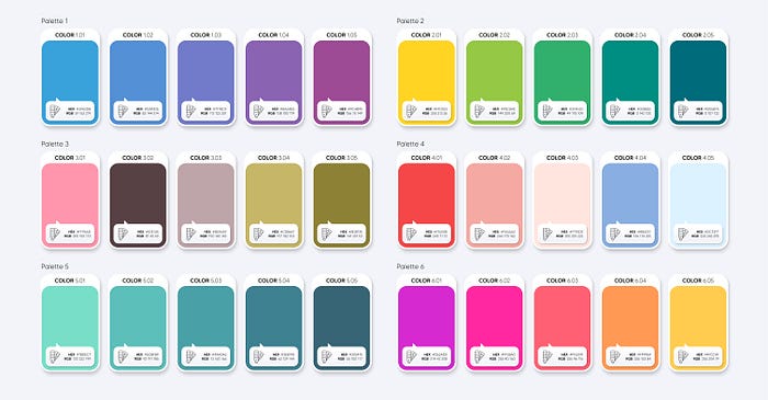
A well-designed color palette can create a harmonious and aesthetically pleasing composition, while a poorly designed palette can create a disjointed or overwhelming effect.
Custom color schemes: Designers and artists may also create custom color palettes based on their specific needs and preferences, such as incorporating certain colors that have a particular meaning or significance
Color palettes can be used in a variety of design and art projects, such as graphic design, interior design, painting, and more.
Color Balance
Color balance can be used to correct color imperfections in your image. You can also use a color balance to create dramatic effects by changing the overall mixture of colors used in your composite

Color Balance works with complementary colors that have inverse relationships: cyan and red, magenta and green, and yellow and blue.
This means that if an image has too much cyan in it, the cyan will need to be decreased, which will cause the red value to increase.
Color Depth
Color depth refers to the maximum number of colors an image can contain.
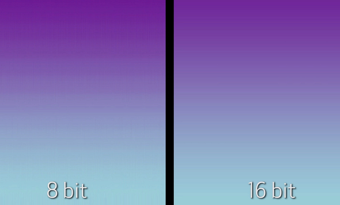
The most common normal color depths you’ll see are 8-bit (256 colors), 16-bit (65,536 colors), and 24-bit (16.7 million colors) modes.
True color (or 24-bit color) is the most frequently used mode as computers have attained sufficient levels to work efficiently at this color depth
These concepts are used by artists, designers, and other professionals who work with color to create visually appealing and effective compositions. Understanding these fundamentals can help individuals make informed decisions about color choices, combinations, and effects.
By understanding the principles of balance, contrast, emphasis, unity, and proportion, as well as the elements of line, shape, texture, color, and typography, designers can create designs that communicate their desired message or idea.
